Data Visualization Sections
PPE Reporting's Data Visualization sections include:
Bar Graph Analysis
The Bar Graph Analysis Section is a customizable section that shows up to 20 bar graphs. Each graph shows data for a different measure.
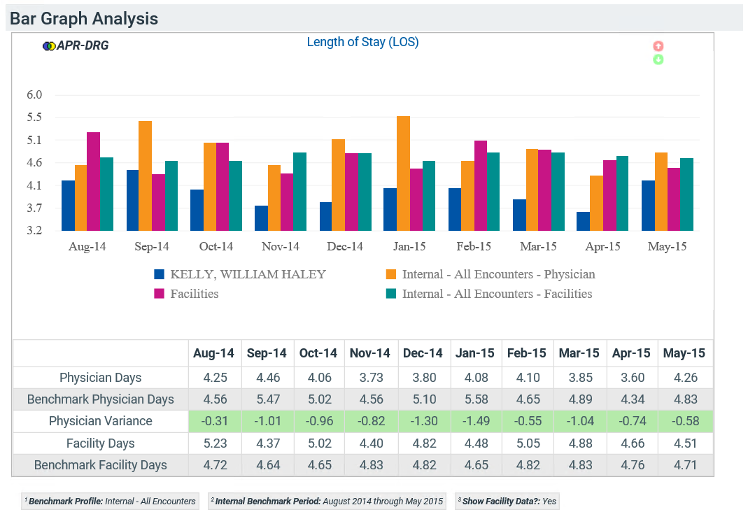
The graphs have either two or four bars for each listed month on the x-axis.
- Blue bar: Report physician value
- Orange bar: Benchmark physician value
- Pink bar: Facility value
- Teal bar: Benchmark facility value
The tables next to the graphs show different information depending on the measure chosen. The tables include values for the physician, peer group, and possibly the facility for each month in the period.
Measure Analysis
Each Measure Analysis section shows up to 20 measures and often spreads over several report pages.
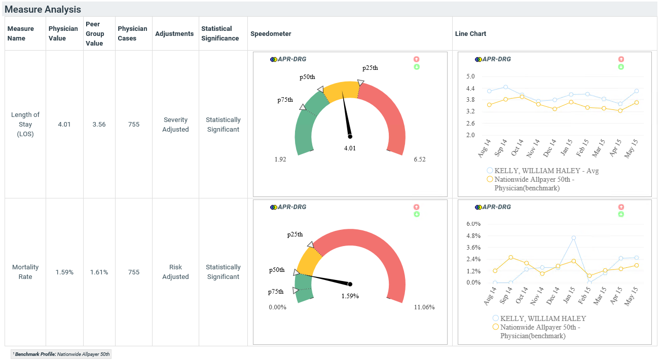
The section consists of a large table, with one row for each measure.
Block Types
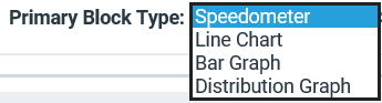
Similar to the Two Column Section in Scorecards, the Measure Analysis section lets you pick two different types of blocks, both of which display on the report.
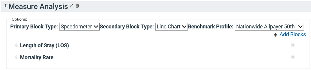
You can choose between a speedometer, line chart, bar graph, and distribution graph (box and whisker plot).
Custom Benchmark Values
This section allows you to display your own benchmark values for each measure. Select Custom Values as your Cutoff Type, then type in your "Target" and "Acceptable" values. You must select your Target Benchmark to be more favorable than your Acceptable Benchmark; this means the Target value must be higher or lower than the Acceptable value, depending on the polarity of the measure.
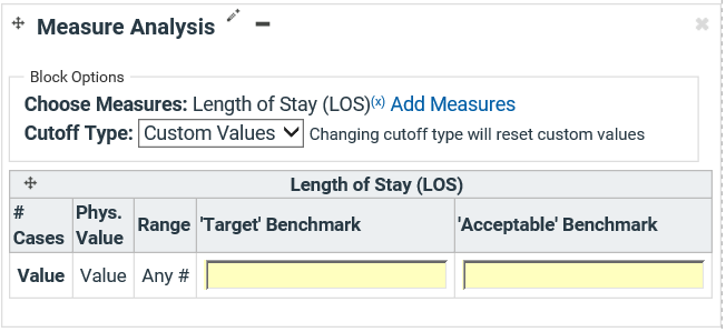
Table Columns
| Column | Description |
|---|---|
| Measure Name | Lists the name of the specific measure |
| Physician Value | The average measure value per encounter for the specific physician |
| Peer Group Value | The corresponding average measure value for the chosen peer group; this is a risk-adjusted value based on your chosen Grouping Type |
| Physician Cases | Total number of encounters the physician had for the measure |
| Adjustments | Lists any adjustments applied to the measure, such as risk or severity adjustment |
| Statistical Significance |
Lists whether the number of physician cases is sufficient to compare physician data to the peer group data.
|
| Chart | Displays a bar chart, a distribution graph, a line chart, or a speedometer |
| Chart | Displays a bar chart, a distribution graph, a line chart, or a speedometer |
Two Column Section
The Two Column Section in PPE Reporting functions the same as in Scorecards.
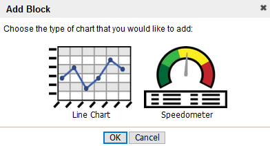
- Add the section to the tab and click Add Block.
- Select if you would like a line chart or speedometer, then click OK.
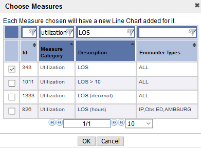
- Select your measure(s) of interest; click OK.
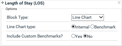
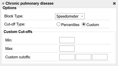
- Select if you would like custom or standard benchmarks/Cut-Offs; note that the options look slightly different for the different chart types.